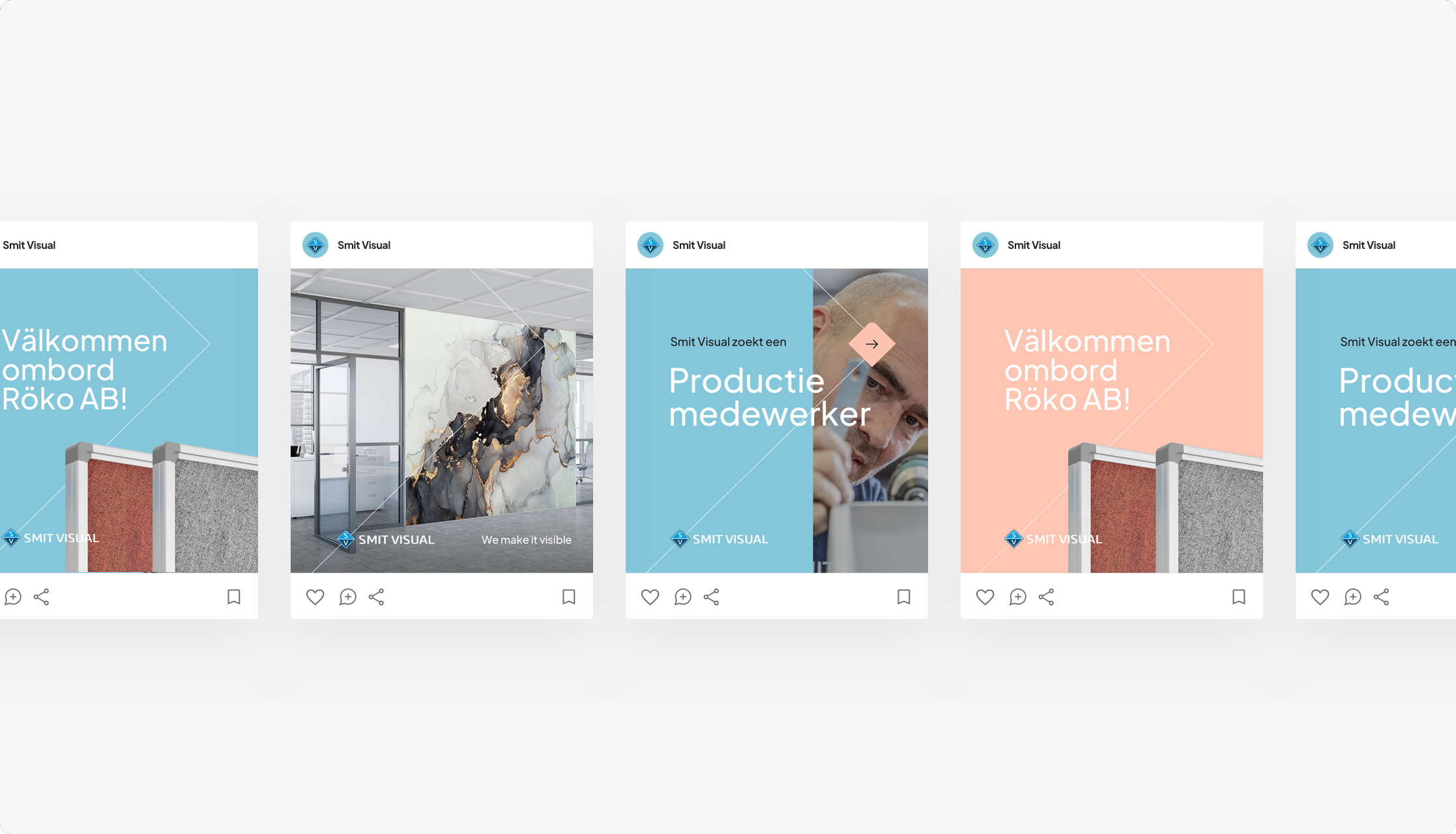
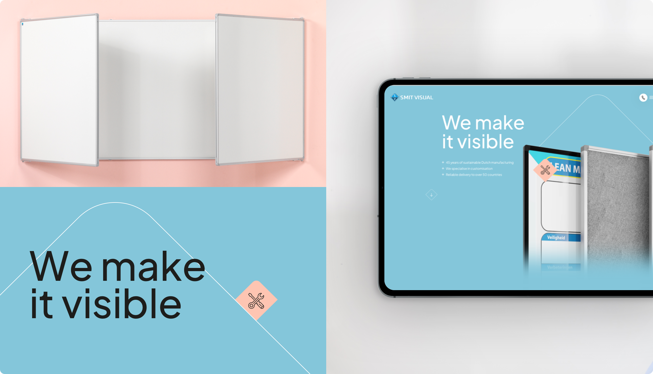
Smit Visual is an international company that develops custom whiteboards, wall boards and hanging structures for clients in 50 countries worldwide. In the process, only strong materials and high-quality writing surfaces are used for long-term use. The tremendous growth Smit Visual has experienced in recent years has led them to take a critical look at their own brand and proposition. A case study of the complete rebranding of the Smit Visual brand and the realization of a new website that aptly conveys Smit Visual’s unique products and way of working.
In brief
- A comprehensive
brand identity process
in which we completely redesigned the Smit Visual brand. - Followed by a full-fledged rebranding (including brand guide) that gave Smit Visual all the frameworks for consistent brand communication in one compact document.
- A contemporary new website that fits seamlessly with a design-driven organization, featuring on-page storytelling, sophisticated graphic lines and elegant web animations.
- A website with a focus on functionality and usability, thanks to fully developed user flows and user stories in the concept phase.

Ferdinand LamHead of Creation
“Why a new brand identity? Brand identity brings organizations back to the essence of the organization and the brand. What do we stand for and where do we want to go? An indispensable basis for proper and sustainable positioning.”
Ferdinand LamHead of Creation
A new brand identity as a foundation for rebranding
During the very first conversations with Smit Visual, it became immediately clear that the need for a new visual identity was great. An identity that would act as an umbrella for all brand communications. To firmly establish that new foundation and also document it, we went through the following steps with the client.
- The first brand session To develop a new set of inspiring core and brand values.
- A second brand session To determine the brand archetype, brand positioning and tone-of-voice.
- The development of a complete brand identity document.
An appropriate visual identity
for Smit Visual
At Smit Visual, they fully understand that a strong brand proposition requires consistent brand communication. To ensure that consistency both online and offline, we captured the entire rebranding in a professional brand guide. A brand guide is a concise document describing all the rules and agreements surrounding the use of a brand (in words and images).
- A new logo
- A new logo
- A new corporate identity (colors, shapes and fonts)
Flowing customer journeys based on user flows and user stories
Smit Visual’s new (visual) identity lives in all pages of the new website. From the limitless possibilities available in the creation of a whiteboard to the sheer craft that on-the-job professionals put into the development of the boards. With beautiful black-and-white production videos (that play automatically the moment you scroll past that block) and animations that subtly emphasize Smit Visual’s “custom” nature.
Nice features further realized:
- A user-friendly and versatile CMS with complete freedom for the client.
- Easily build your own pages with flexible content blocks.
- Optimal measurability throughout the website by properly configuring Google Tag Manager.
- The behavior of visitors on the website is visualized and monitored in a Google Dashboard and are thus visible to the client in real time.


