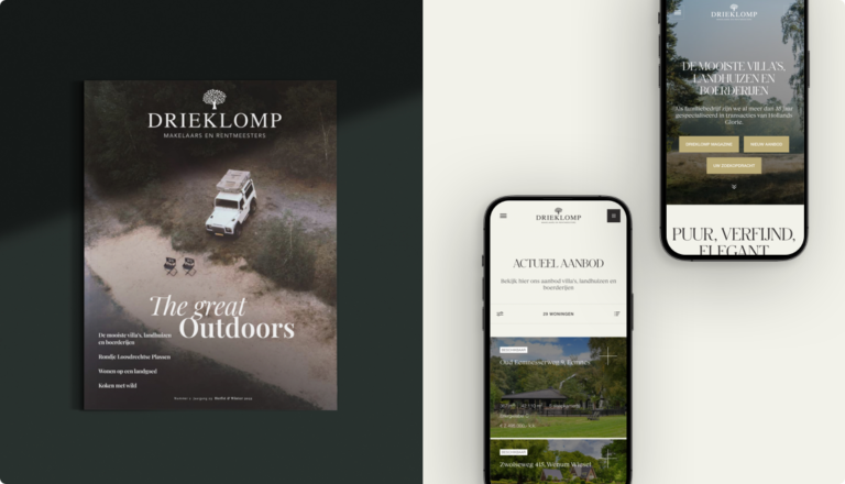
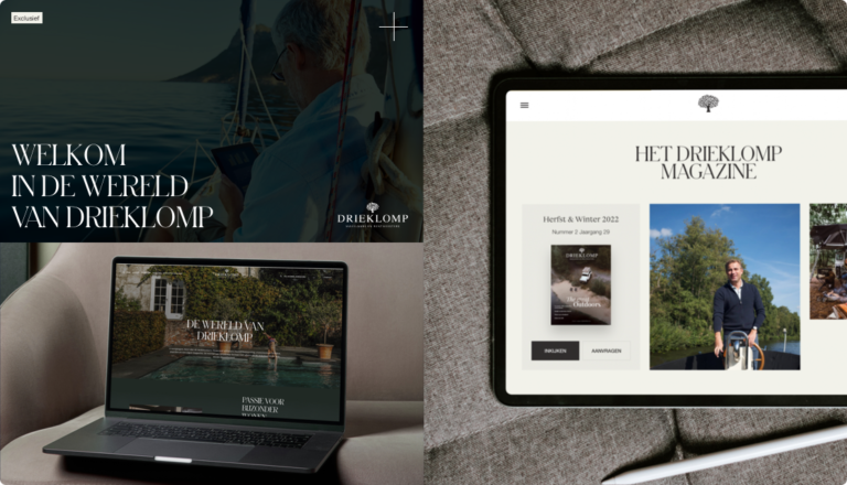
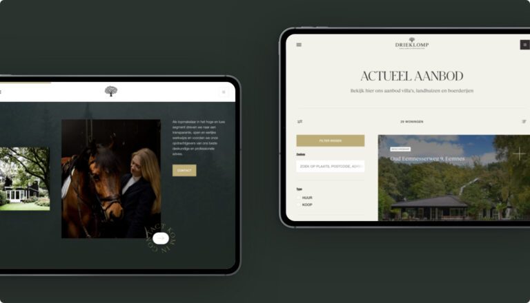
For decades, Drieklomp Makelaars & Rentmeesters has been a renowned, if not THE renowned name when it comes to special living in the exclusive segment. From luxurious villas to magnificent mansions and lavish horse farms. And everyone wants to be a part of that. Realtors proudly carry the Drieklomp name and sellers brag when their at Drieklomp is in the window. That not everything is based on status and glory was evident when Drieklomp brought to us the desire for an innovative real estate website with all the smart automation possible.
In brief
- A complete
brand identity trajectory
in which we re-branded and reframed the entire Drieklomp brand. - A translation of the brand identity into a concept web design with all pages incorporated into a prototype.
- A new website that instantly communicates the feeling of exclusivity, luxury and care and features several smart API links.
- The website features a multitude of (subtle) animations and visual expressions without loss of performance.

Ferdinand LamHead of Creative
“Why a new brand identity? Brand identity brings organizations back to the absolute essence of their brand. Only then can you position your brand correctly and sustainably.”
Ferdinand LamHead of Creative
Back to the essence of the Drieklomp brand
To reposition Drieklomp Makelaars & Rentmeesters and develop a strong foundation for the new visual identity and web design, we worked with a delegation from the client to go back to the essence of the Drieklomp brand. After two extensive brand identity sessions and the development of a completely new brand identity document, it is black and white what Drieklomp Makelaars & Rentmeesters stands for and what purpose they serve.
A brand identity document further consists of:
- Description of brand essence
- Description of brand character
- Description of brand strategy
- A set of inspiring core and brand values
- Brand archetype: HERO
- A Clear Tone-of-voice
A prototype with elaboration of all pages and functionalities
Based on the new brand identity document, the elaborated user flows and user stories, the first wireframes of the new website were put on paper. When visualizing the structure and pages, a deep dark green color scheme was deliberately chosen. A color that perfectly matches Drieklomp’s brand character and immediately communicates a sense of exclusivity, luxury and total care.
To include the closely involved client in all the choices made, all the pages were first worked out in a prototype.
Smart links for automation and lead generation
In the prototype, all functionalities and web animations for Drieklomp were already visible. But the real intelligence and automation is integrated at the development stage. For example, the smart search function ensures that you always find what you’re looking for within a few clicks, and the intuitive API links with RealWorks and others make it possible to automatically link housing listings, calendars and files and follow up on new leads instantly.
By building the website as lean as possible (read: processing as little data as possible), it is possible to apply a multitude of animations and full-screen imagery, without any loss of performance.


