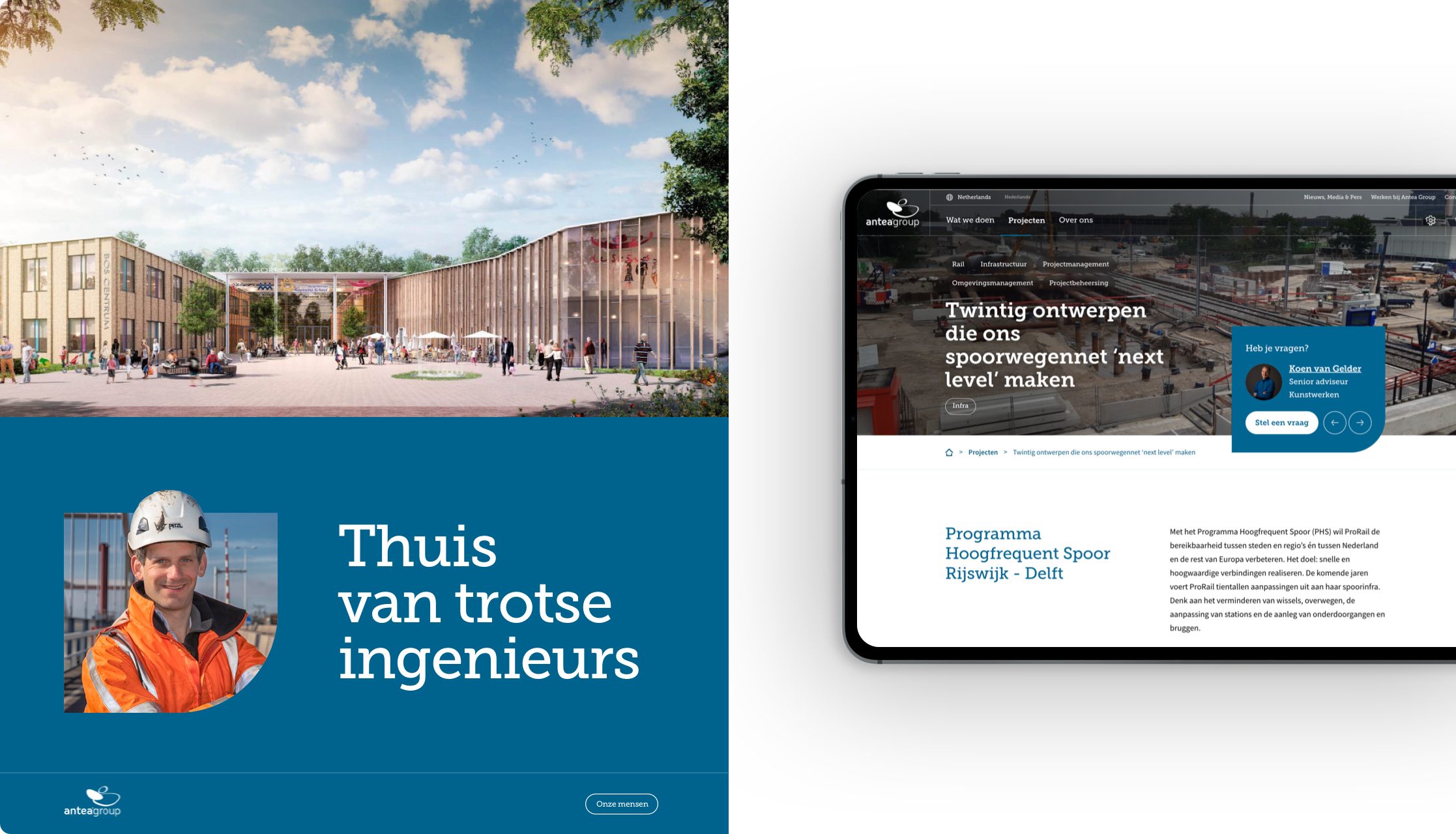
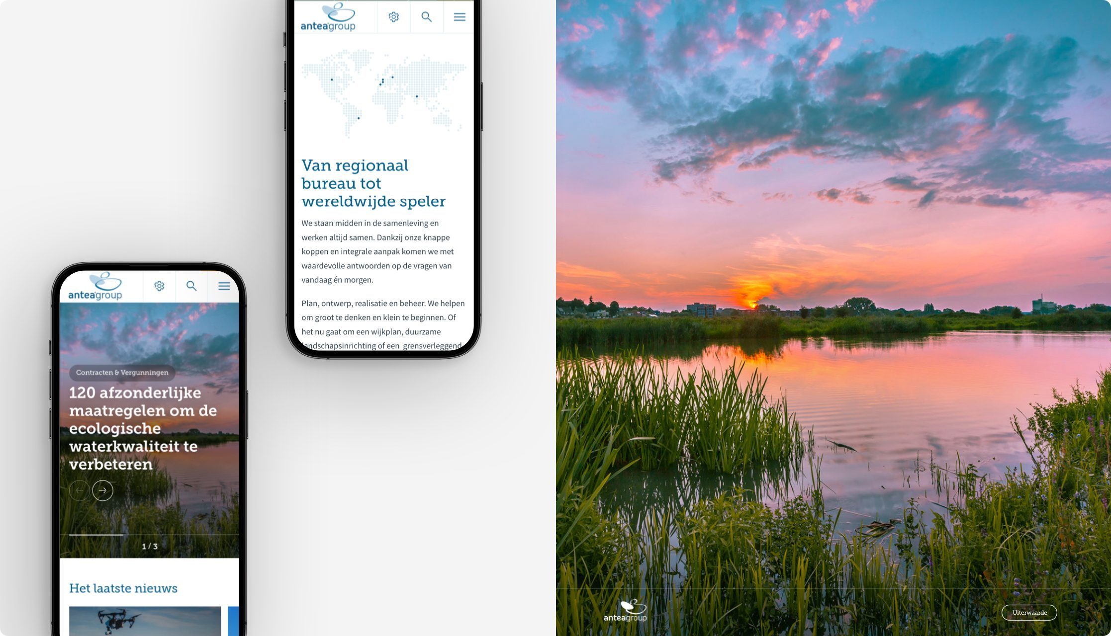
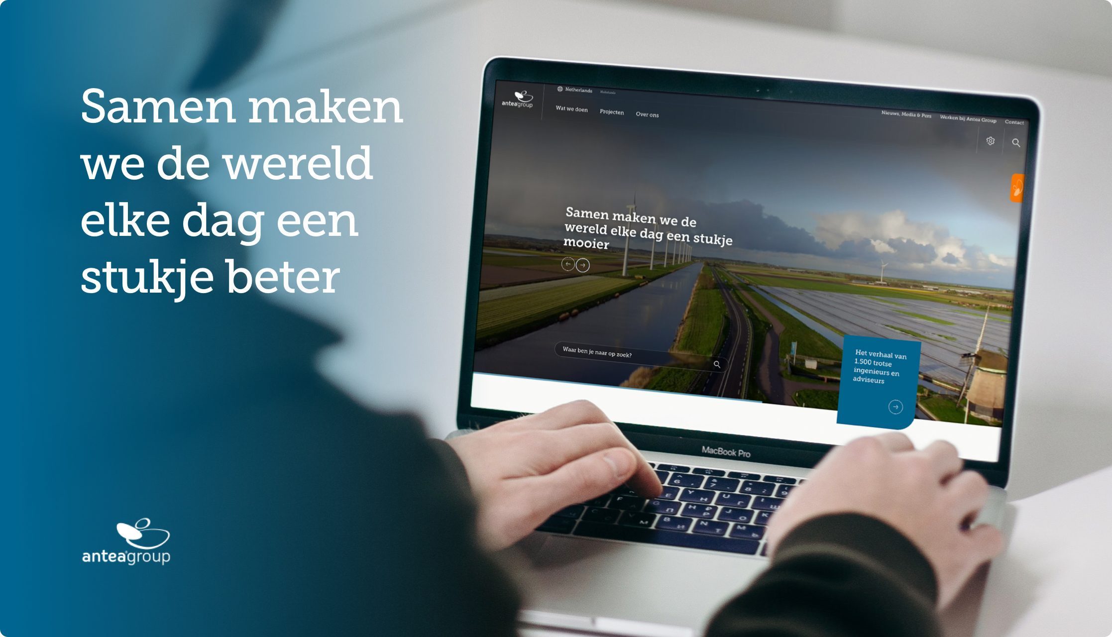
Antea Group is committed to a beautiful, healthy and accessible living environment for ourselves and for generations to come. Digitally, Antea offers a comprehensive knowledge platform with themes, sectors, projects and services. In 8 different countries, which means the information and communication on each platform is different. The client’s wish was therefore to develop a powerful platform with a clear structure within which new components could be added flexibly based on the wishes of 8 different countries and stakeholders.
In brief
- Throughout the process, the wishes and needs of the 8 stakeholders were guiding and realized from start to finish.
- By starting in the design phase by writing out user flows and user stories, we had a powerful basis for working out the concept and wireframes.
- The new platform is extremely user-friendly and features an optimal structure with corresponding search functionality.
- In accordance with the three-click-rule, visitors to Antea Group have all information at their fingertips.

Lars GroenewaldDigital Designer
“User flows are schematic representations of all the touchpoints, decisions and actions a user undergoes when visiting the website. User stories describe the type of user and the purpose with which that user visits the Web site. By detailing both, you get a complete picture of all the pages and functionalities the website should contain.”
Lars GroenewaldDigital Designer
Smooth navigation through 28,000 pages of information
Whereas Antea Group’s engineers have the challenge of thinking about every built-up square foot, the focus on this project was on bringing structure to the vast information facility. 28,000 pages of topics, services, knowledge articles and research reports.
By first writing out user flows and user stories, there was a strong and well-founded foundation for the wireframes. Wireframes that literally define the structure as the skeleton of the website and were transformed into an initial visual translation only after thorough user testing and review with all 8 stakeholders: the concept design.
Customer journeys based on country-specific search behavior
The new structure and the flexible underlying Content Management System “Smart CMS” (based on user-friendly WordPress) also allows the different countries to choose a front page that best suits their business line. They can thus easily create their own customer journeys and user flows. Precisely tailored to the needs and search behavior of users in that specific country.
A Content Management System (CMS for short) is the management environment of a Web site. Often, a CMS is a Web application on which users can easily place documents and data on the Web site without much technical knowledge.
Anytime, anywhere access within 3 clicks
That the information overload has still resulted in a fluid user experience is an achievement of note. In accordance with the three-click-rule, which says users should be able to complete any task within 3 clicks, visitors to Antea Group have all information at their fingertips. Regardless of what they are looking for and what country they are currently operating in.
The intelligent search functionality, which structures a search query directly into results by “service,” “project,” “news” or “other” certainly contributes to this.


